Note: You are on the beta version of our docs. This is a work in progress and may contain broken links and pages.
UI Components
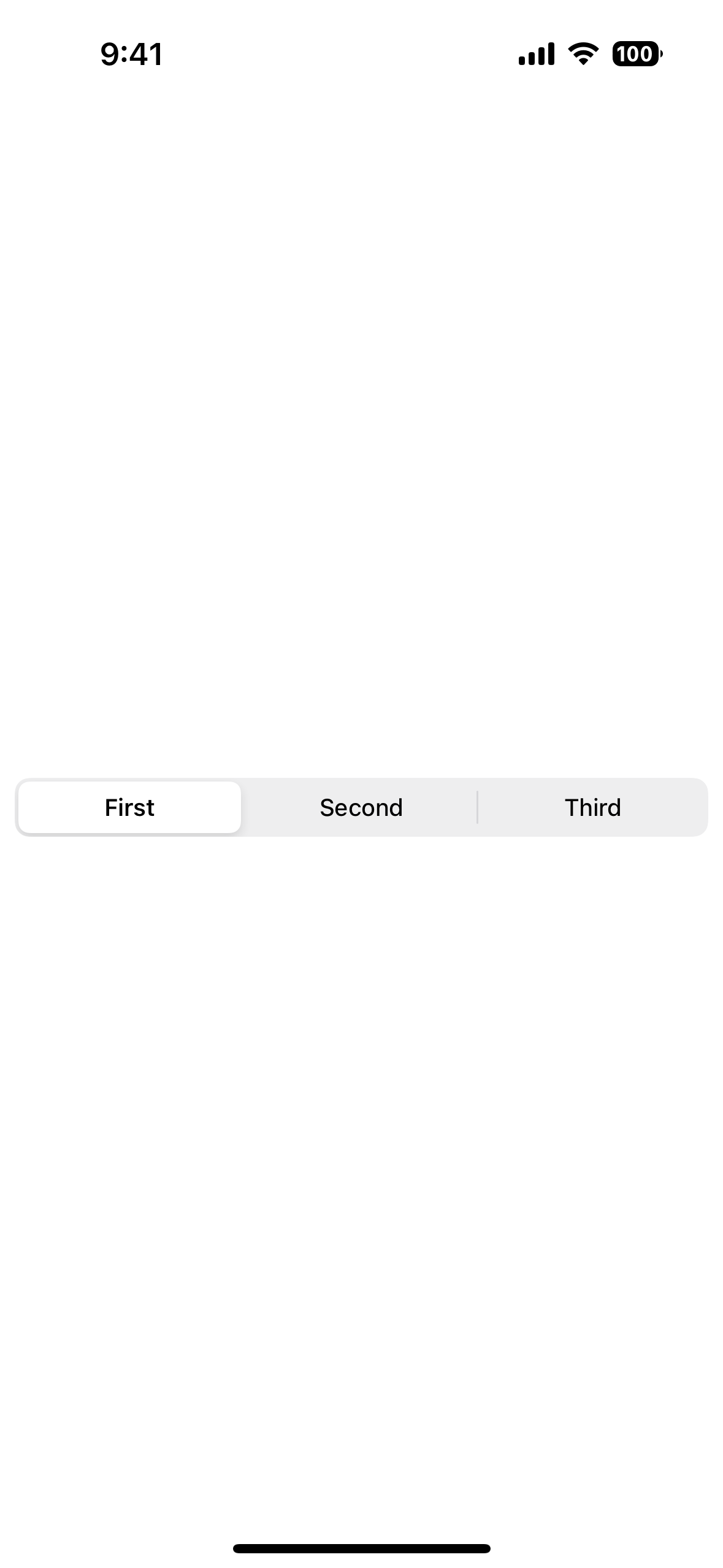
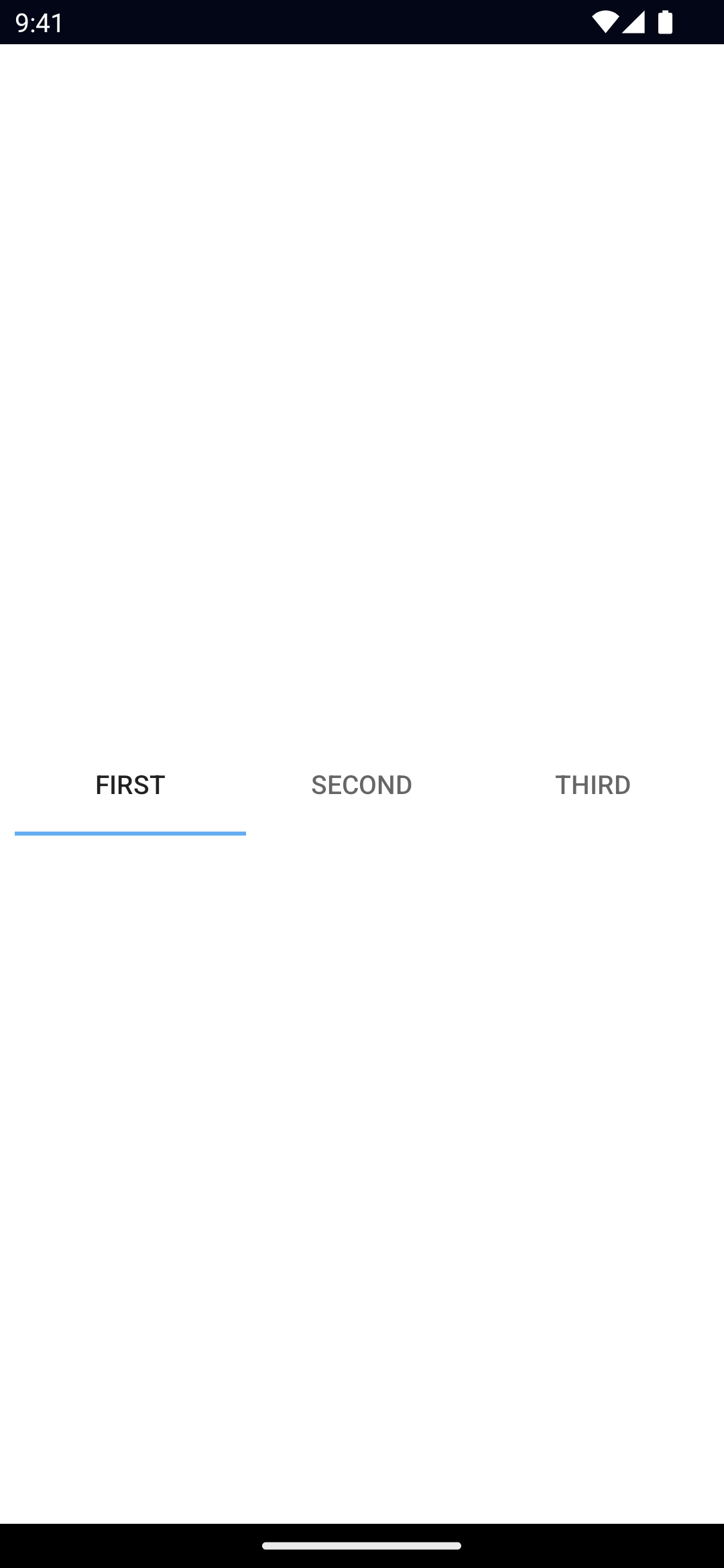
SegmentedBar
UI component for discrete slection.
<SegmentedBar> is a UI bar component that displays a set of buttons for discrete selection.
xml
<SegmentedBar>
  <SegmentedBarItem title="First" />
  <SegmentedBarItem title="Second" />
  <SegmentedBarItem title="Third" />
</SegmentedBar>
Props
items
ts
items: SegmentedBarItem[]An array of items to be displayed in the SegmentedBar.
selectedIndex
ts
selectedIndex: numberGets or sets the index of the selected item.
selectedBackgroundColor
ts
selectedBackgroundColor: ColorGets or sets the background color of the selected item.
To set the background color of the entire bar, use backgroundColor.
See Color.
...Inherited
For additional inherited properties, refer to the API Reference.
SegmentedBarItem Props
title
ts
title: stringGets or sets the title of the SegmentedBarItem.
Events
selectedIndexChanged
ts
on('selectedIndexChanged', (args: EventData) => {
  const segmentedBar = args.object as SegmentedBar
  console.log('SegmentedBar index changed to:', segmentedBar.selectedIndex)
})
Emitted when an item in the SegmentedBar is tapped.
Native component
- Android:
android.widget.TabHost - iOS:
UISegmentedControl

