UI Components
Label
UI component for displaying text.
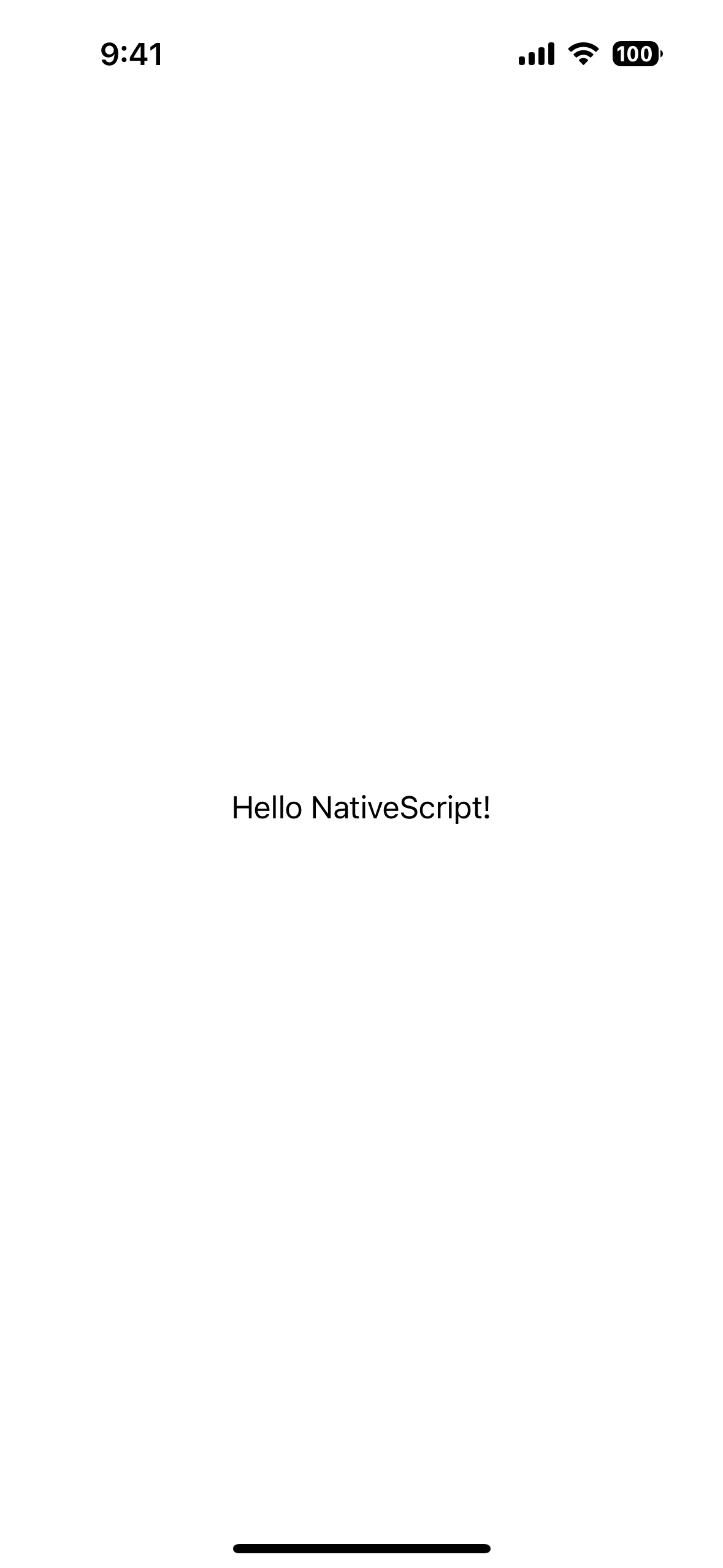
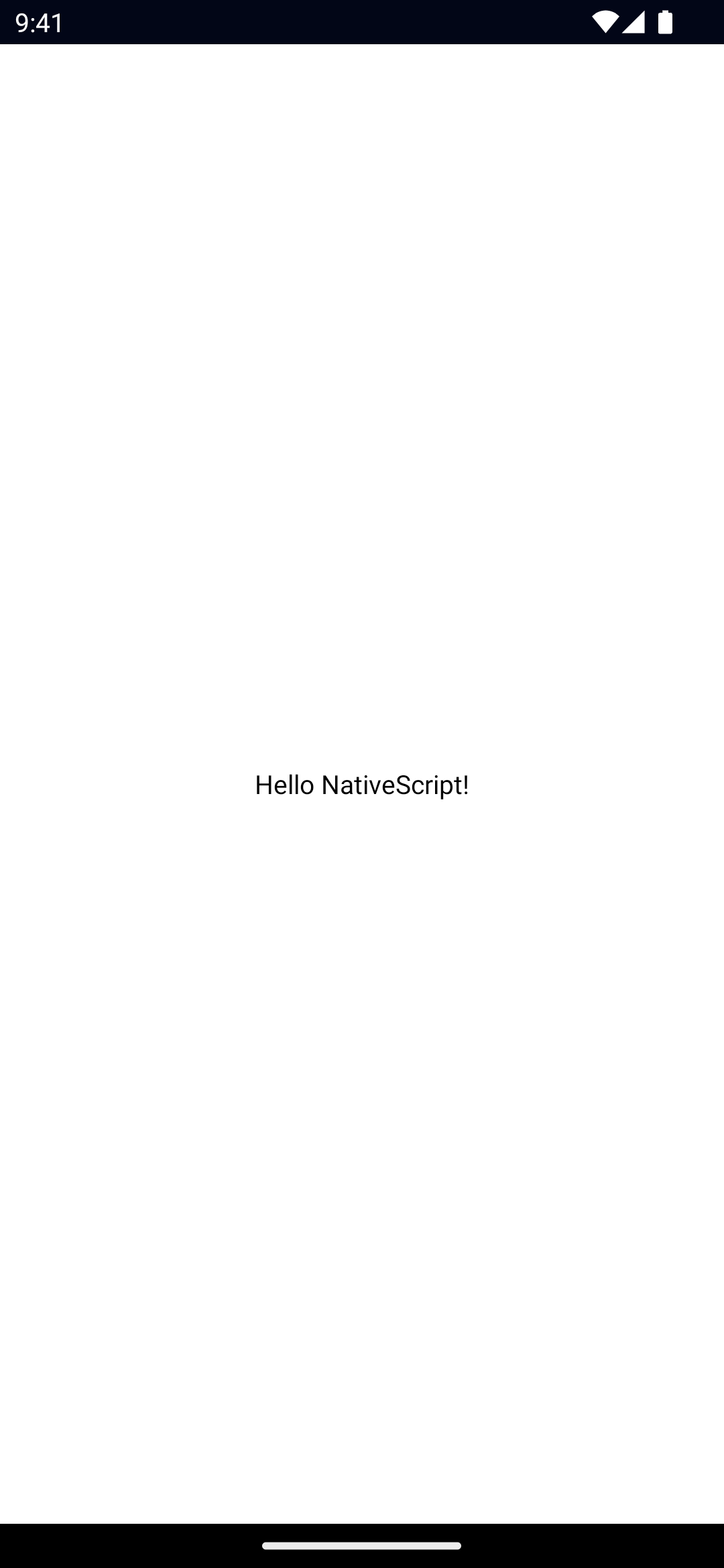
<Label> is a UI component that displays read-only text.
Note
The NativeScript <Label> is not the same as the HTML <Label>.


<Label text="Hello NativeScript!" />Examples
Formatting text inside a button
If you need to style parts of the text, you can use a combination of a FormattedString and Span elements.
<Label textWrap="true">
  <FormattedString>
    <Span text="This text has a " />
    <Span text="red " style="color: red" />
    <Span text="piece of text. " />
    <Span text="Also, this bit is italic, " fontStyle="italic" />
    <Span text="and this bit is bold." fontWeight="bold" />
  </FormattedString>
</Label>
Props
letterSpacing
letterSpacing: numberGets or sets the letter spacing.
lineHeight
lineHeight: numberGets or sets the line height.
See MDN: CSS line-height.
text
text: stringGets or sets the text shown.
textAlignment
textAlignment: 'initial' | 'left' | 'center' | 'right' = 'left'Gets or sets the text alignment style property.
Defaults to left.
textDecoration
textDecoration: TextDecorationType // "none" | "underline" | "line-through" | "underline line-through"Gets or sets the text decoration style.
See TextDecorationType.
Defaults to none.
textTransform
textTransform: TextTransformType // "initial" | "none" | "capitalize" | "uppercase" | "lowercase"Gets or sets the text transform.
See TextTransformType.
Defaults to initial.
textWrap
textWrap: booleanGets or sets whether the label should wrap longer text to new lines.
Default value is false.
whiteSpace
whiteSpace: WhiteSpaceType // "initial" | "normal" | "nowrap"Gets or sets white-space handling.
See WhiteSpaceType and MDN: CSS white-space.
Defaults to initial.
...Inherited
For additional inherited properties, refer to the API Reference.
Native component
- Android:
android.widget.TextView - iOS:
UILabel
- Previous
- Image
- Next
- ListPicker

