Note: You are on the beta version of our docs. This is a work in progress and may contain broken links and pages.
UI Components
Button
A basic native button that reacts to user gestures.
<Button> is a UI component that displays a button which reacts to user gestures.
For more information about the available gestures, see Gestures.
xml
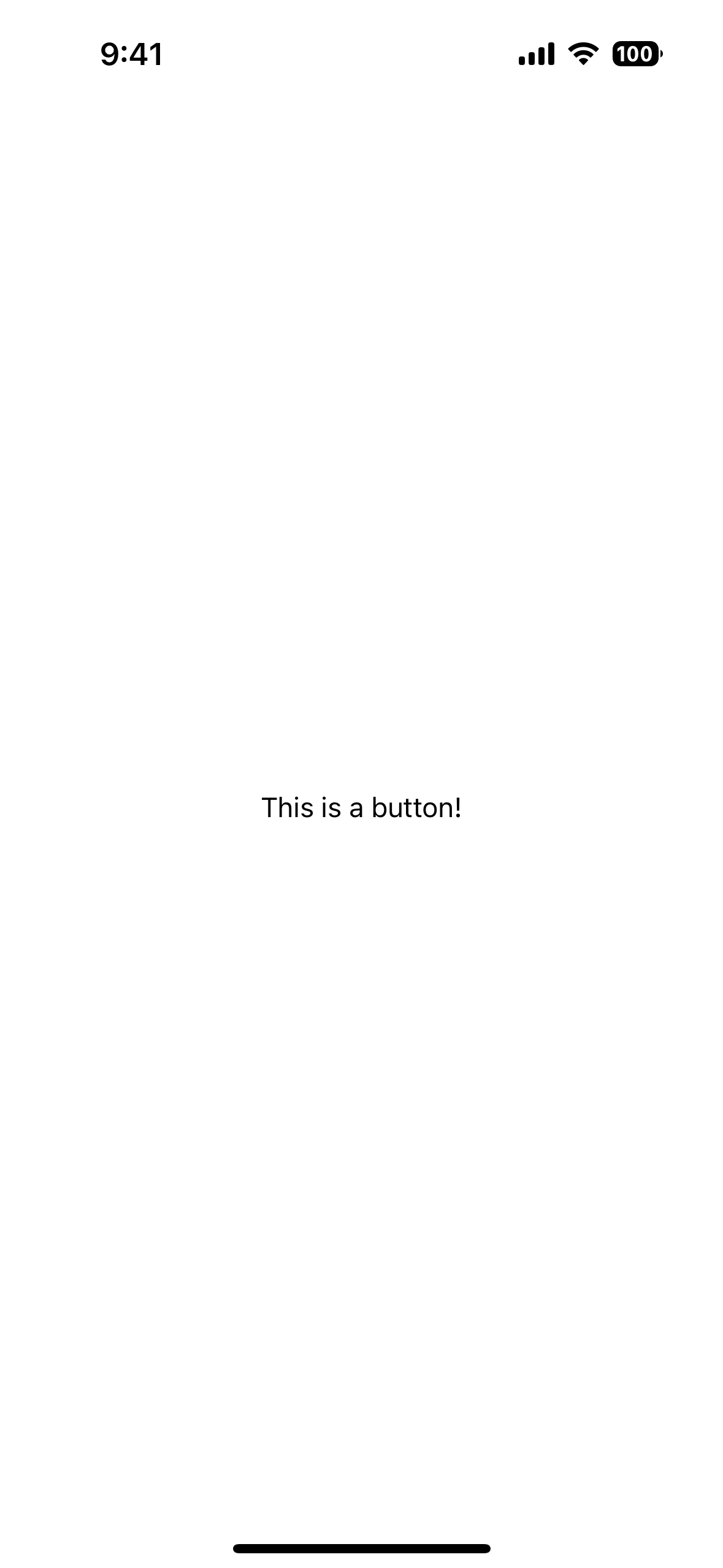
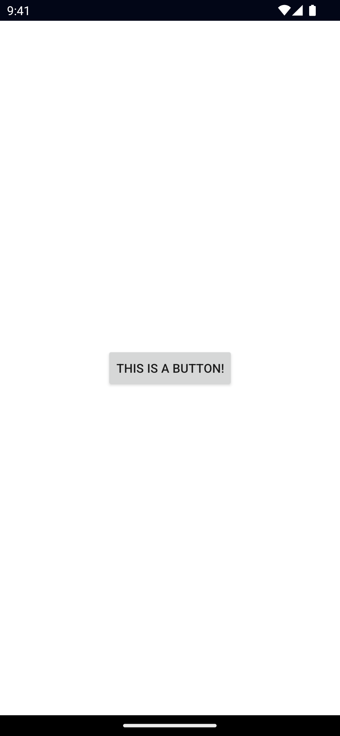
<Button text="This is a button!" />Examples
Formatting text inside a Button
If you need to style parts of the text, you can use a combination of a FormattedString and Span elements.
xml
<Button>
  <FormattedString>
    <Span text="This text has a " />
    <Span text="red " style="color: red" />
    <Span text="piece of text. " />
    <Span text="Also, this bit is italic, " fontStyle="italic" />
    <Span text="and this bit is bold." fontWeight="bold" />
  </FormattedString>
</Button>
Props
text
ts
text: stringSets the text shown in the button.
textWrap
ts
textWrap: booleanGets or sets whether the button should wrap longer text to new lines.
Default value is false.
isEnabled
ts
isEnabled: booleanAllows disabling the button. A disabled button does not react to user gestures.
Default value is true.
...Inherited
For additional inherited properties, refer to the API Reference.
Events
tap
ts
on('tap', (args: TapGestureEventData) => {
  const button = args.object as Button
  console.log(`The button has been tapped!`)
})
Emitted when the button is tapped
See TapGestureEventData.
Native component
- Android:
android.widget.Button - iOS:
UIButton
- Previous
- ActivityIndicator
- Next
- DatePicker

